We all have heard the well-known proverb, “What you see is sold.” The same principle applies to the business world. Whether a customer goes through the website, an application, or a social media feed, catchy images and graphics play a vital role in grabbing the user’s attention.
In the present day, business owners understand this, so they pay attention to designs. But how to create unique graphics that captivate users’ eyeballs? Let’s understand the basic graphic design principles in this post that will help you create stunning graphics from scratch.
Globally, many businesses hire highly skilled graphic designers who can help them connect with their audience to create a strong relationship. However, it isn’t just about the graphical presentation or creative concept that makes a design great.
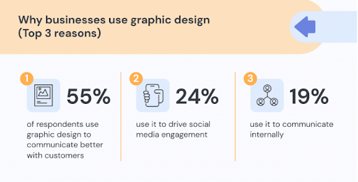
A great design lets your customers know what you are all about. The success of a company relies heavily on an incredible and robust design. Moreover, 55% of businesses rely on eye-catching graphic designs to communicate betterly with their customers.
Source: Pictochart
Companies have now realized the value of great design and the opportunities it can bring. To establish their presence in the market strongly, they are investing in great designs that will help them do so.
But What is Good Design Actually?
Good design is evident. You can find it anywhere, inside and outside of everyday objects. A striking lampshade, a unique wine glass, any restaurant’s menu, or a decorative throw pillow are just a few examples.
It’s not just about eye appeal when it comes to good design. There must be a balance between form and function. Good design enhances a space while working efficiently. Effortlessly, it combines function and posh. The design trends are constantly changing. However, methods have not changed. You can deconstruct good design into principles that determine the outcome.
In general, what are graphic design principles? Here’s what we need to know.


Top 8 Graphic Design Principles Explained
This graphic design principles guide will lead you in the right direction by taking it back to basics. If you have recently left school or have self-taught yourself, it’s well worth brushing up on your design knowledge to ensure you can master the tools and techniques that will make your work shine.
We recommend reviewing the below-mentioned graphics design fundamental principles of visual design and elements that help to create good designs.
Emphasis
Start by asking yourself, What is the most important fact your audience needs to know? Then, the design should focus on this information most heavily.
Organize the information into hierarchical categories by imagining a design in your mind and letting your brain organize it. Then, use your graphic design to communicate this visual order based on this mental design.
Consider placing the most important information in the center or making it the most significant part of the design, using an attractive font, or using bold or contrasting colors to grab the reader’s attention. By following these graphic design tips, one can surely create an eye-appealing design to engage with their audience.
Balance
It is important that your graphics have a sense of balance. To create this feeling of balance, each side doesn’t need to be symmetrical, but the visual weight of each side should feel cohesive and intentional. Three designs can determine visual weight:
- Brighter and bolder: Colors have a greater visual impact than softer and lighter colors.
- Dimension: There is more visual weight in elements that are larger.
- Thickness: Thicker lines carry more weight visually than thinner ones.
Visual balance that is asymmetrical occurs when the visual weight is intentionally and thoughtfully imbalanced between the two sides. When this happens, you will typically use white space to balance out the other side of the graphic.
White Space
Unlike the usual meaning of space, space in design can mean something different. Space can be viewed as both negative space and positive space when it comes to graphic design. It is imperative to include both in your design. Each of these spaces works closely with the other, which can significantly affect the overall design or image you are creating. Positive space is defined as the area within which objects are placed. These spaces are always full, and they contain a variety of objects.
Negative space, on the other hand, is the area between objects. The term “negative space” is also used for white space. In design principle, copy space is also an example of a space. This is the blank space where the designer might place their text. It’s, therefore, crucial to create a perfect design that strikes the right balance between these kinds of spaces.
Color Combination
We can see 1 million different colors with the human eye, and each of us is taught from a young age what certain colors mean. A traffic light is a perfect example. While they are just colors, we learn that red means stop, green means go, and yellow means step on the metal because you don’t have to wait until it turns red.
In other words, when we see a specific color, we take different actions, sometimes without even realizing it. There is no doubt that color is a fundamental aspect of design and dictates the mood of a design. The palette you choose should represent your brand and its tone, so be careful when choosing colors.
Hierarchy
The same is true when you want to combine more than one element. Ensure you maintain the hierarchy when you prioritize any design sections. When maintained properly, it allows the brand to focus only on the priority elements of the design. Among its features are highlighting titles, important messages, focusing on images, and many others.
To help viewers identify where to begin looking, hierarchy creates visual organization in the design. You can arrange items such as headings, subheadings, and main content. The hierarchy in a design must be maintained in this way. It should be applied when combining different elements. Make sure to maintain the hierarchy of any design section you wish to prioritize.
If properly maintained, it offers the brand the ability to concentrate on its priority elements. In addition to highlighting titles, important messages, images, and symbols, it also highlights the visual elements.
Alignment
Generally, alignment refers to aligning the design elements along the top, bottom, or sides of the design. There is no requirement that aligned elements are of the same type. Left-aligned elements are commonly placed along the left side of the layout. A group of photos of different sizes appears as a unit when aligned across the top or bottom.
Repetition
Repeating elements strengthen the overall design, and they are a fundamental component of any design. No matter if you’re designing a website, a poster, or a business logo, it allows you to create rhythm. Likewise, a book, magazine, or website with multiple pages is more likely to benefit from repetition. This gives the user a better sense of consistency and a better visual experience. You can even apply this concept when designing patterns.
Contrast
This principle is equally important to design, photography, and other visual arts. Because everyone understands what contrast is, we don’t think we need to go too deeply into this. The right amount of contrast between elements allows one to stand out more than another. A minimal contrast between two elements is the best way for designers to blend elements. Having a high contrast creates a sense of separation between the elements.
Follow Graphic Designing Principles to Create Impeccable Illustrations
Having a firm grasp on each of these is crucial to designing layouts that look great and offer a positive user experience. If you are a marketer or an entrepreneur wanting to step up the game by creating stunning designs to catch users’ attention, we can help with that. Clients can obtain excellent graphic design services from us that help to achieve desired and fruitful results faster.